Time to say ciao

Ciao Systems

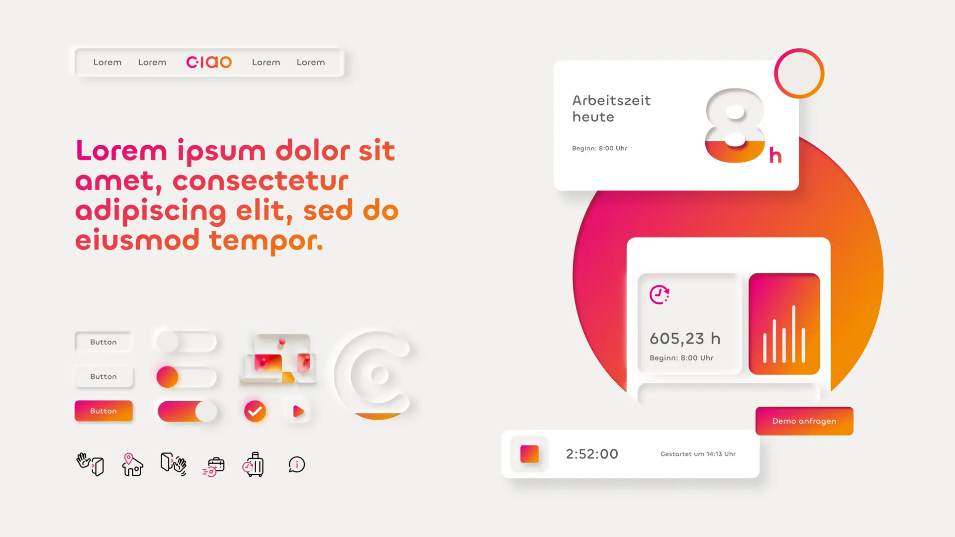
The task was to develop the brand identity and create the simplest possible user experience for the Saas software for recording working hours. Starting with the naming and branding through to the UI/UX optimization of the tool and the website. Key visuals with bold headlines were used to raise awareness.

Services

Naming
Logo Design
Branding
UI/UX Design
Campaign

A logo design concept featuring a gradient pink-to-orange square icon with a stylized white "C" at the top. Below, the word "ciao" is displayed in the same gradient, with blue construction lines outlining its geometric structure, showcasing the design process. The background is light gray.
A modern UI design concept featuring a clean layout with white space, rounded interface elements, and a pink-to-orange gradient. The left side has large placeholder text in a gradient color, a navigation bar, and various buttons and icons. The right side displays time tracking elements, including an "8h" workday indicator, a total tracked hours card, and a timer. The design emphasizes a smooth, minimalistic aesthetic.
A tablet lies on a light gray concrete surface, displaying a gradient background from red to orange with bold white German text reading "Sag ciao zu Deiner Zeiterfassung." Shadows from the tablet and an unseen light source create depth on the surface.A tote bag with a red-to-orange gradient hangs against a white wall with soft shadows. The bag features bold white text that reads "Time to say ciao." and a small "ciao" logo at the bottom. The handles are white, contrasting with the colorful design.
More Cases
Ciao Systems
Design
SaaS-Software
Macu4
Design
Medical technology

Back to overview