Award-winning Concept
DigitalStrom
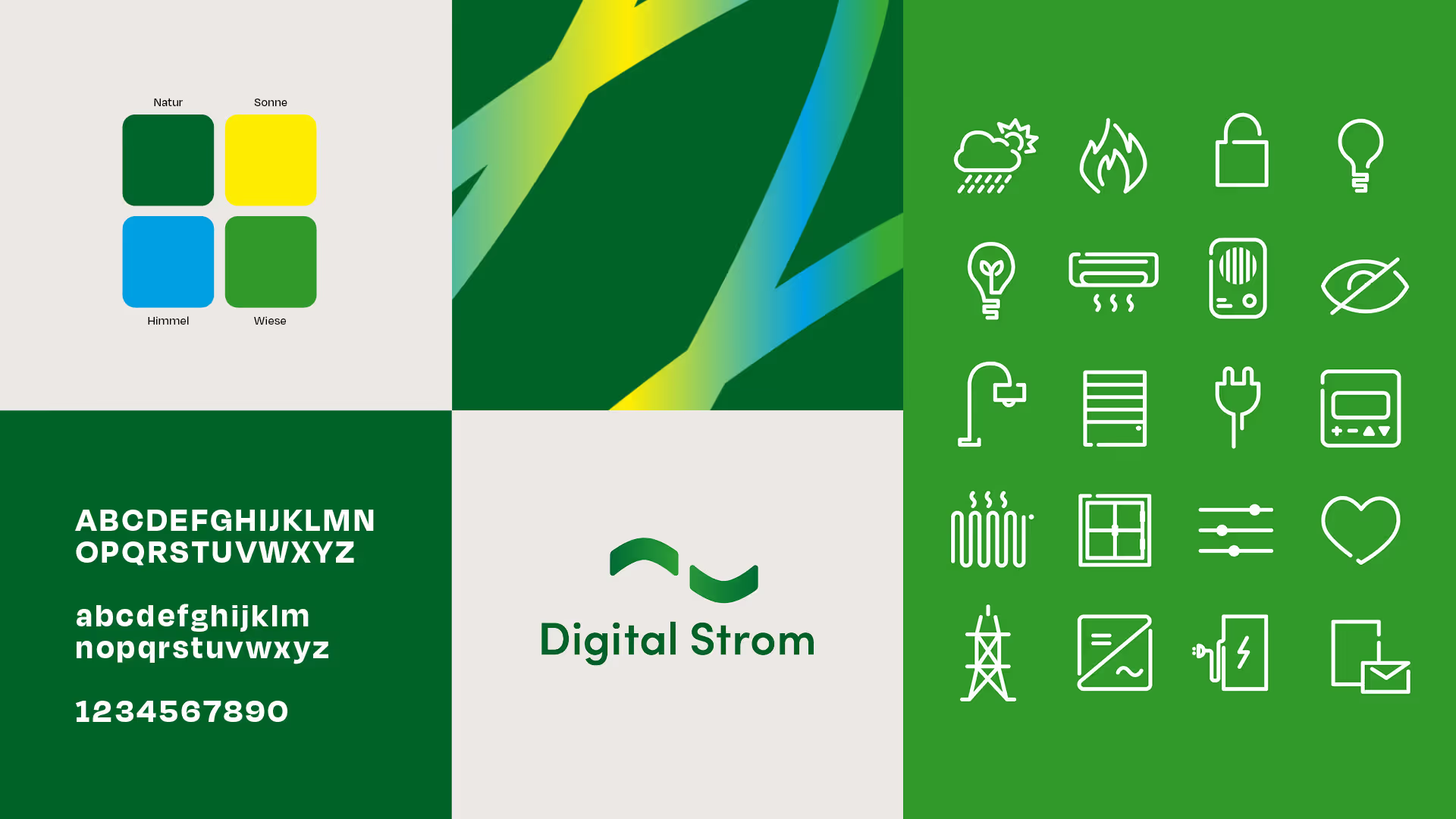
The Swiss building automation company was strengthened through repositioning and rebranding in order to achieve greater awareness among its B2B target group. The completely revamped branding is attracting attention and generating discussion, making the brand's reactivation a success.
Services
Brand consulting
Communication strategy
Positioning
Corporate design
Text strategy
Out of home
Editorial design
Events


Awareness and recognition are increased through communication, which is primarily used at trade fairs, in the field and when addressing target groups directly. The product USP is communicated in a humorous way and the striking appearance ensures visual recognition.


